-
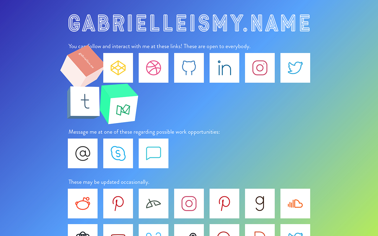
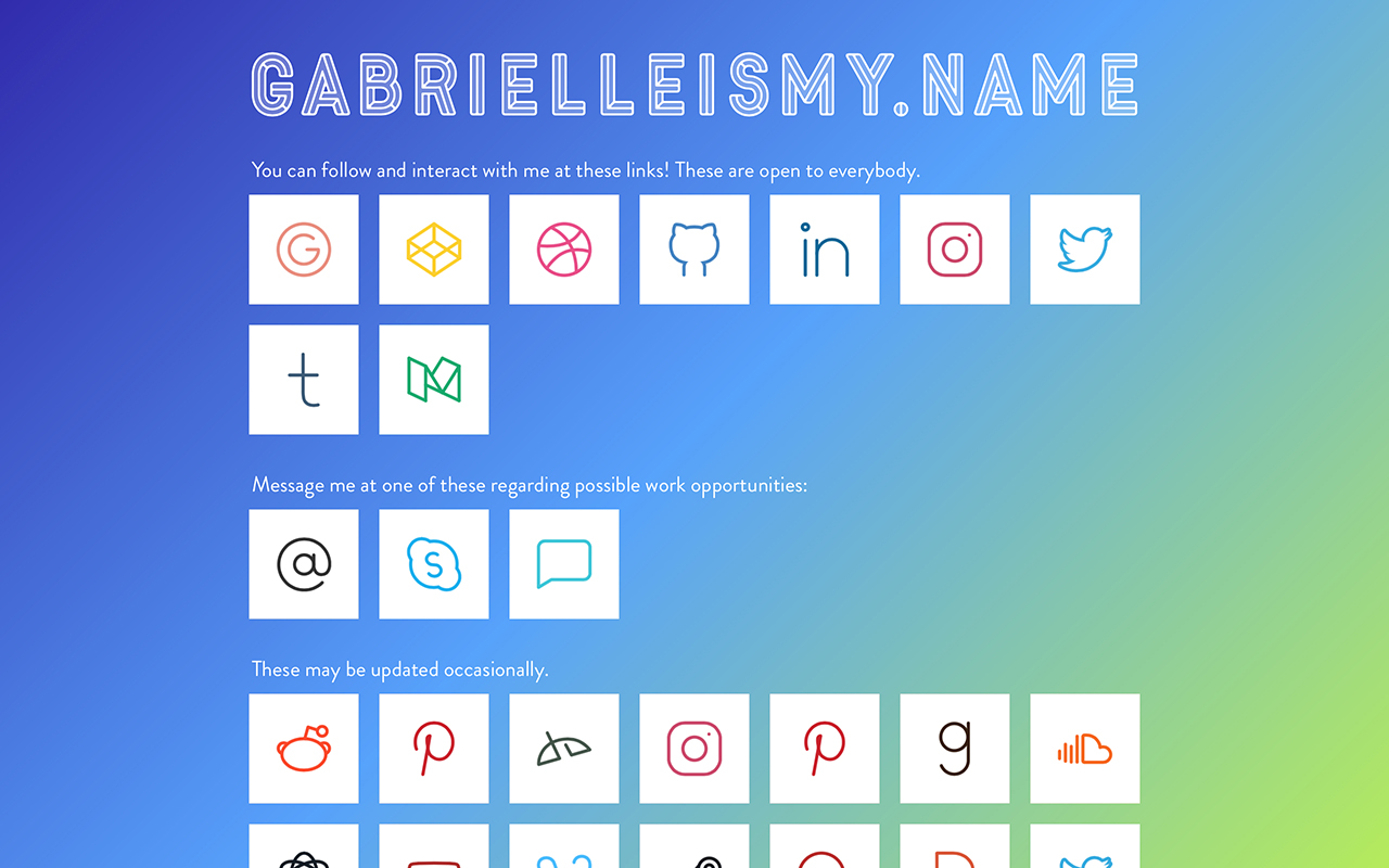
-
Styles
-
Tools
- Sketch
- Github
- Atom
-
Development
- HTML5
- CSS3/SASS
- Git
-
Process
I already had a design for this portal showing my online presence, but I knew that I needed a revamp. Since this site isn’t my main portfolio, I was free to try something new and experimental.
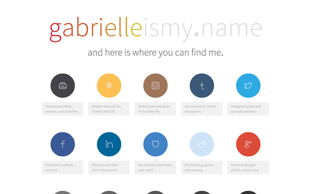
Original site One of the interesting web design topics for me is how to create functional user interactions using only CSS, with little to no Javascript. My more recent tinkering led to a study in 3d transforms and how to create the illusion of depth in a 2d environment.
For each link, I created a cube using
<div>elements as sides, then tinted each side using the linked website’s main color to mimic lighting. On top of each cube is four<a>elements, each representing a different detection area. I use<a>in place of specifying detection areas using Javascript. Each<a>is clipped into a triangle usingclip-path.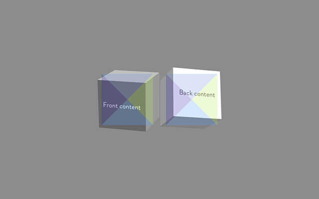
Diagram of each link’s parts Using the general
~selector, each<a>causes the cube to rotate in a different direction. I found that the most realistic rotate was away from the mouse interaction. So if the mouse enters from the left side, the cube should rotate from left to right. After a short delay, the<a>being hovered over will cover the other detection areas to prevent extra movement.Initially this started as a web experiment, but I realized I wanted to use the concept for a website. I added a combination of modified Typicons and Line Icons as well as my own personal vectored icons to personalize each link.
See the Pen CSS-Only Direction-Aware Cube Links by Gabrielle Wee (@gabriellewee) on CodePen.
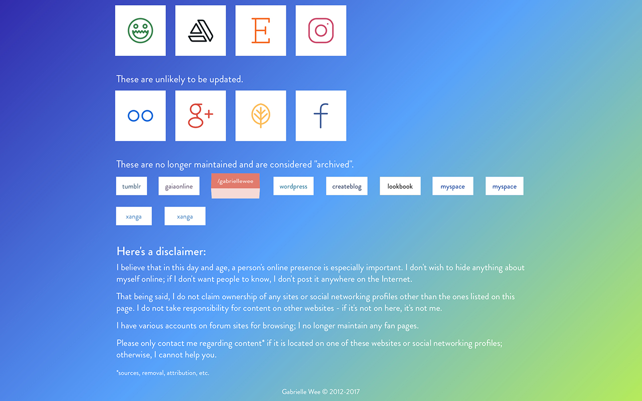
For my "archived" links, I used a simpler version of the cube - each link only rotates in one direction and doesn’t have an icon.
I wrote an article that elaborates on my process as well as provide some visual examples - you can check it out on Codepen and on Medium. If you visit the site, definitely try sweeping your cursor over several cubes at once!
-